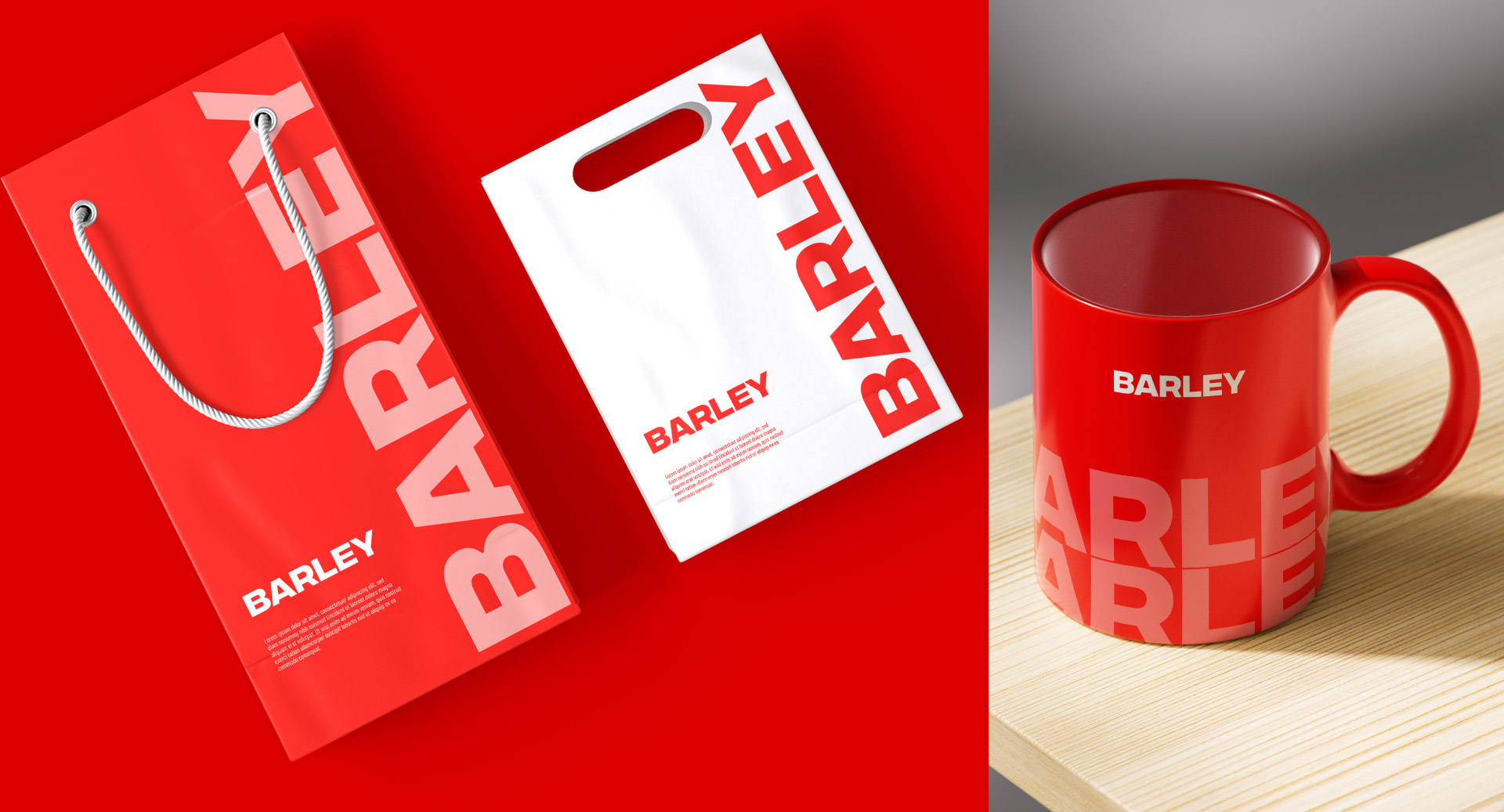
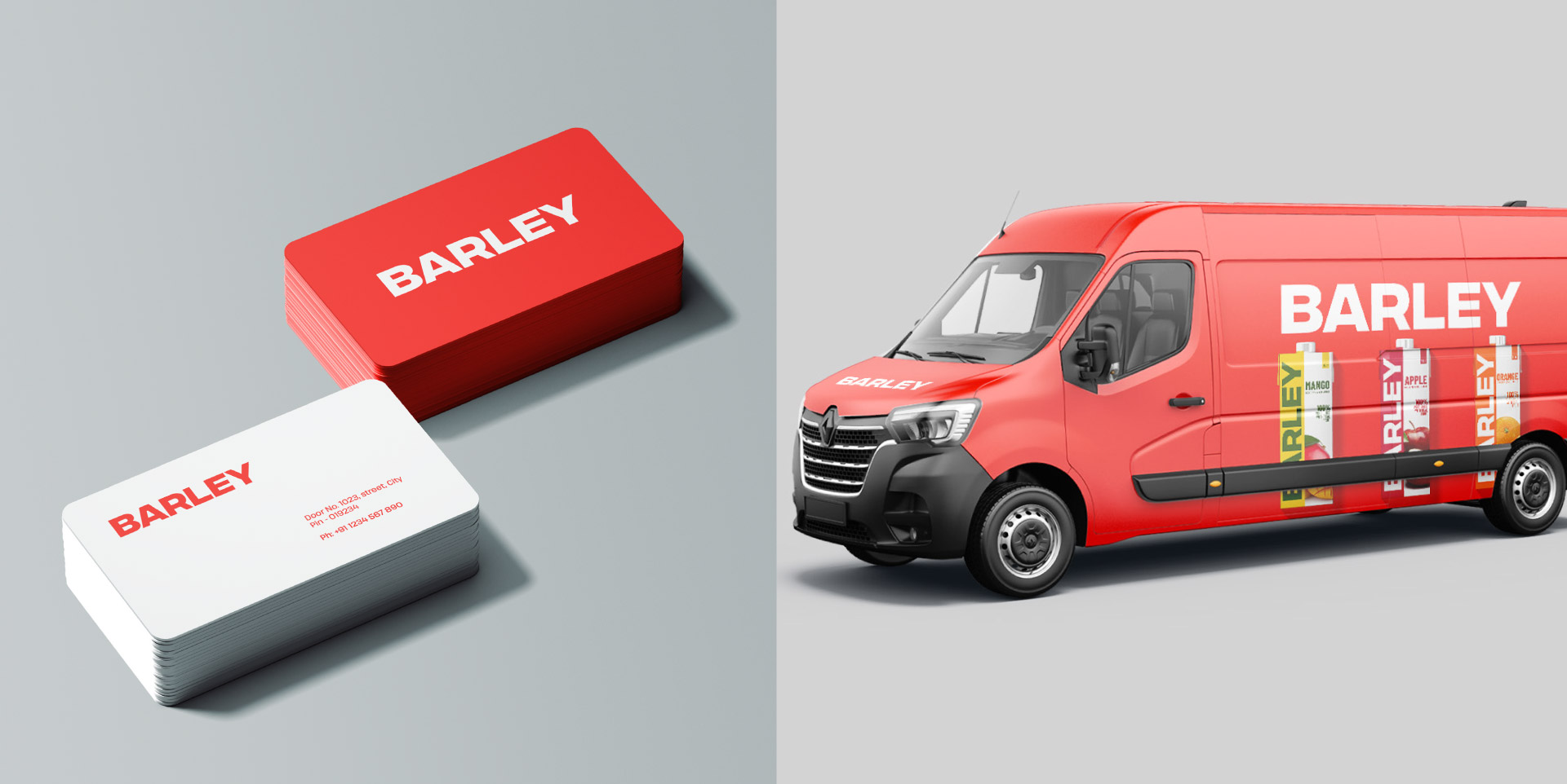
We’re thrilled to share our coruscating branding design work for ‘BARLEY’, the organic fruit juice and drinks brand. For branding, we handpicked a fiery colour. To bring in the pulpiness of BARLEY, we blended it with a graceful, flowy liquid texture, more like a tasty sea wave on which you can surf! The typo, on the other hand, is solid. It says that whichever fibrous turn BARLEY takes, the quality remains constant.

