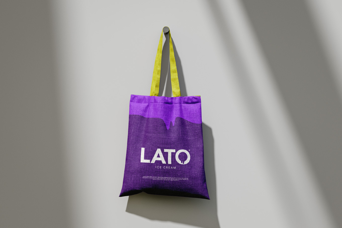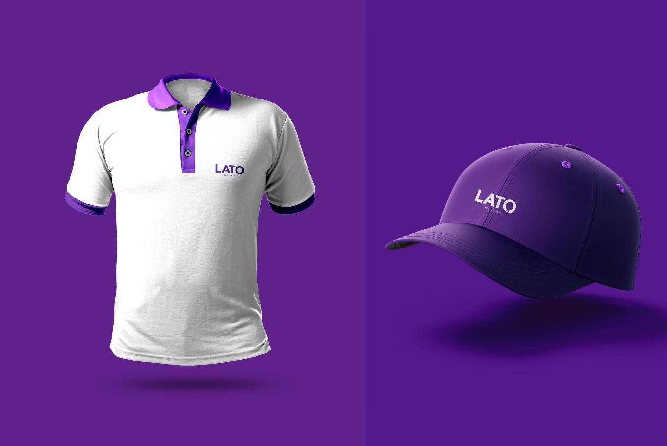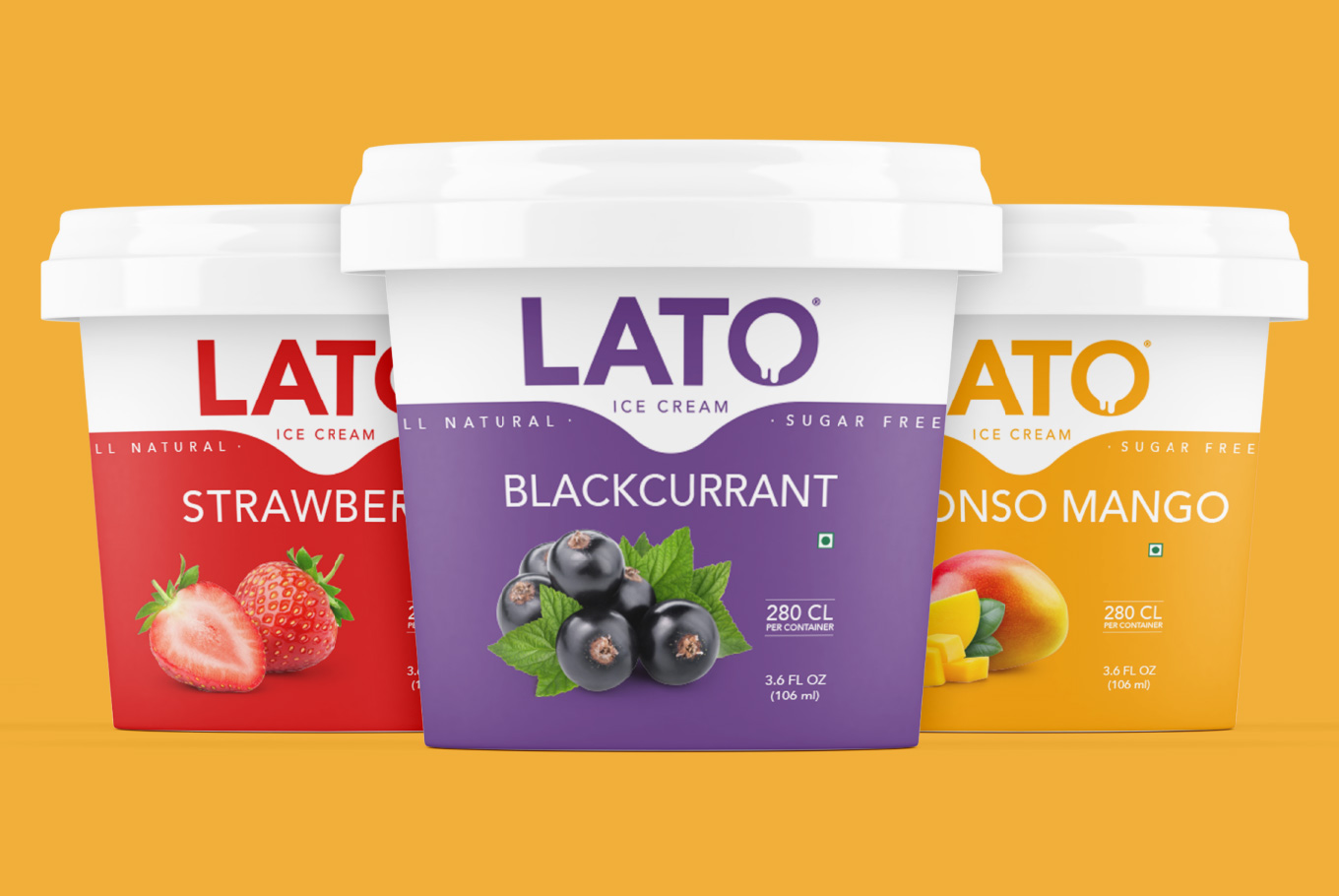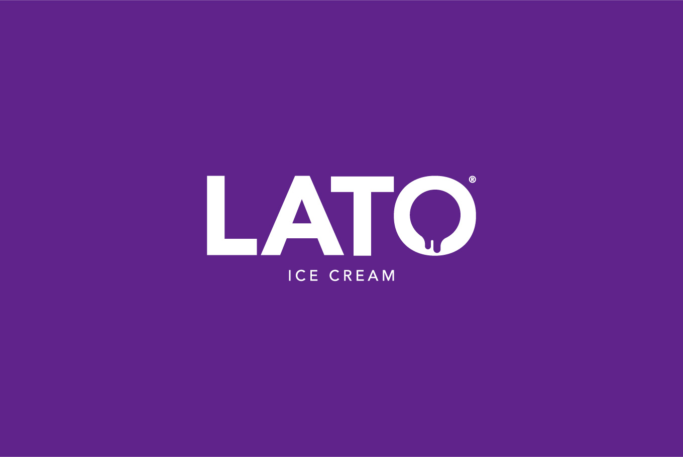
Lato is “wide” in Spanish and “summer” in Polish. It may remind you of the infamous humanist sans serif typeface. But for us, “Lato” is a feeling that belittles every meaning. Keeping our client’s demand in mind, we picked the most vibrant tint of violet. Thinking of how we could add in an extra topping of sweetness, we worked on the ‘O’ of Lato. It shows the overhead view of an ice cream scoop, melting down through the contours of a cone, cup or pot. The melting ‘O’ also implies the unending craving for Lato ice creams. So why wait when you can dive into the creamy ocean? Let’s Lato!