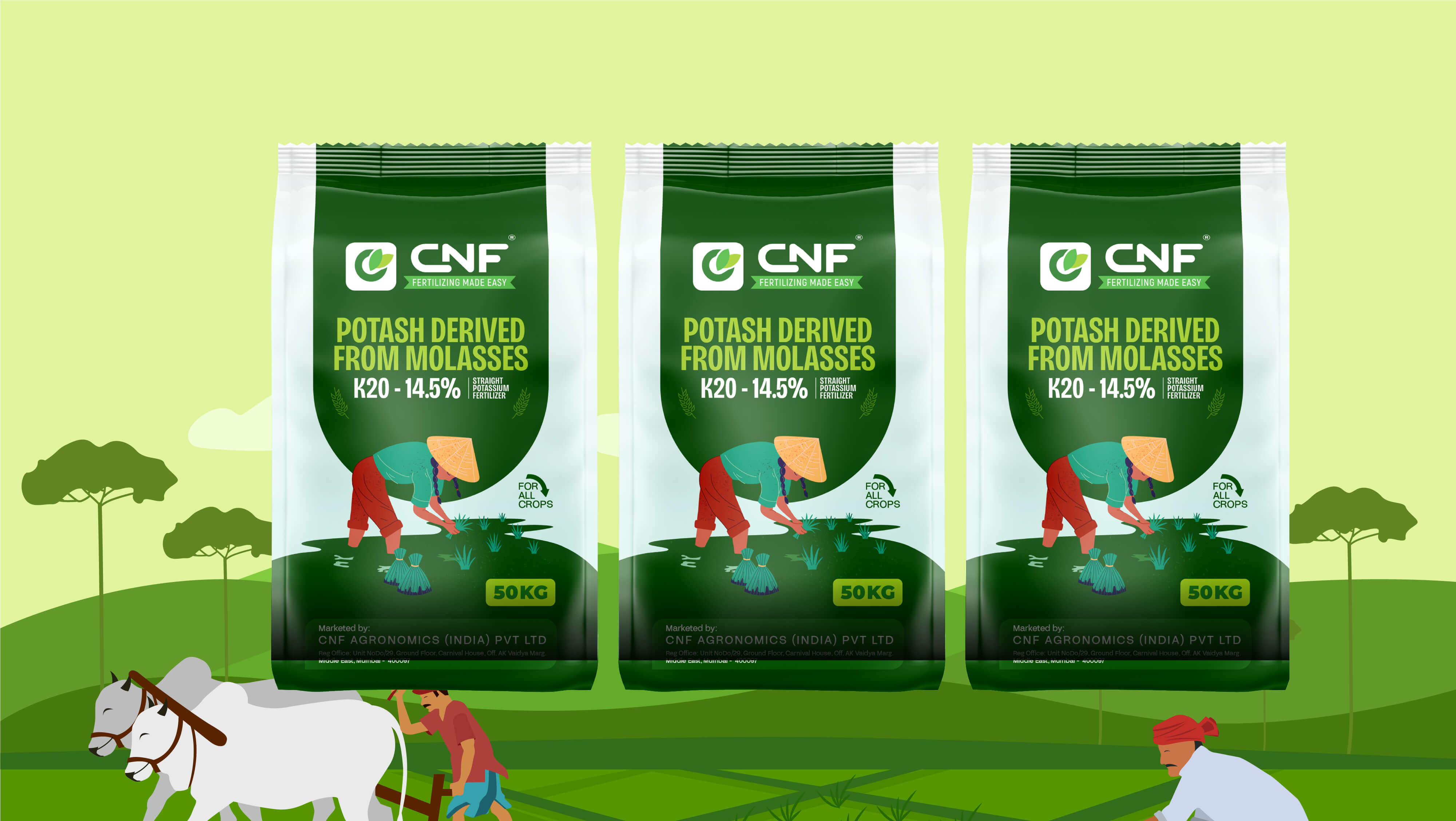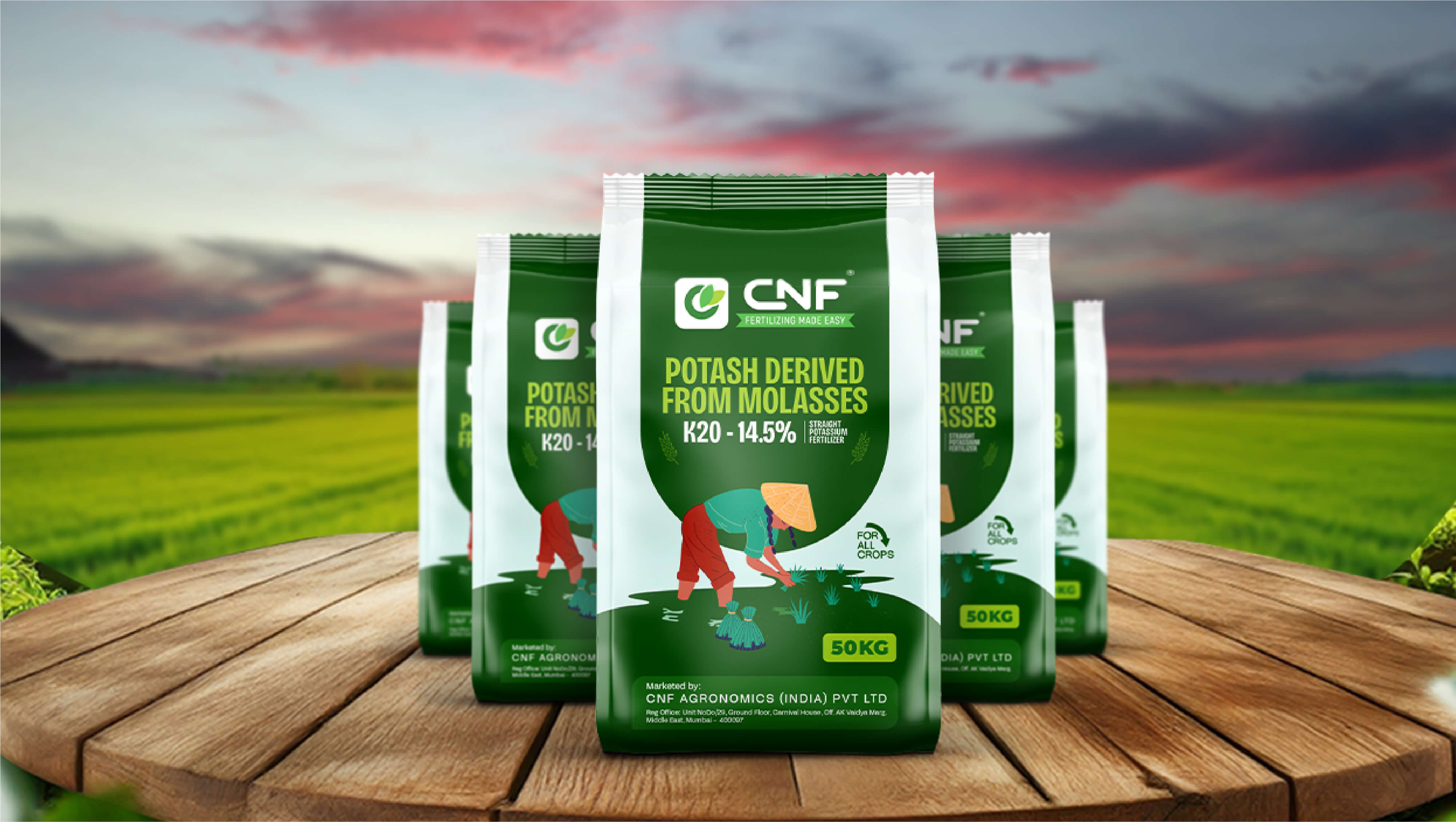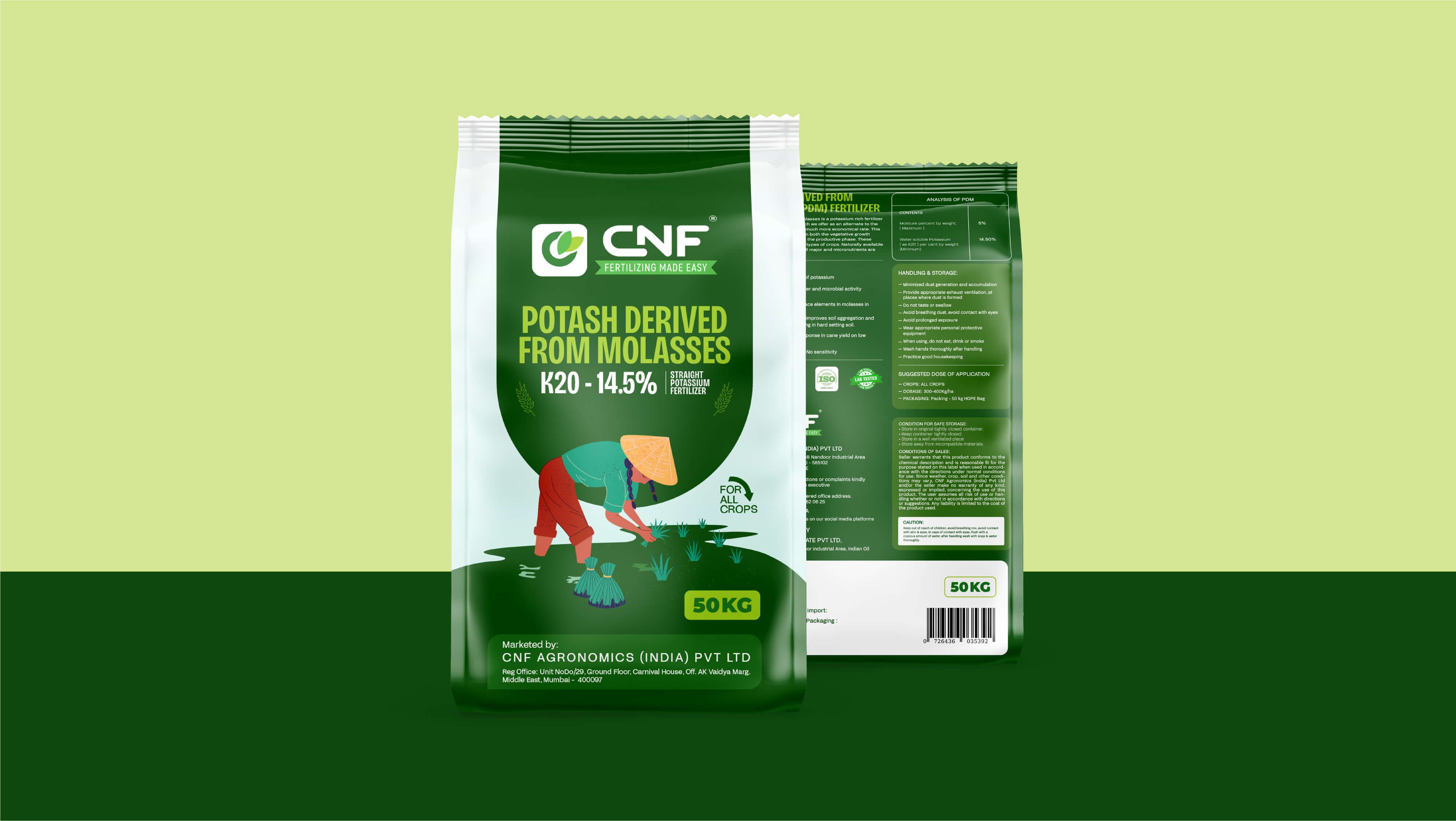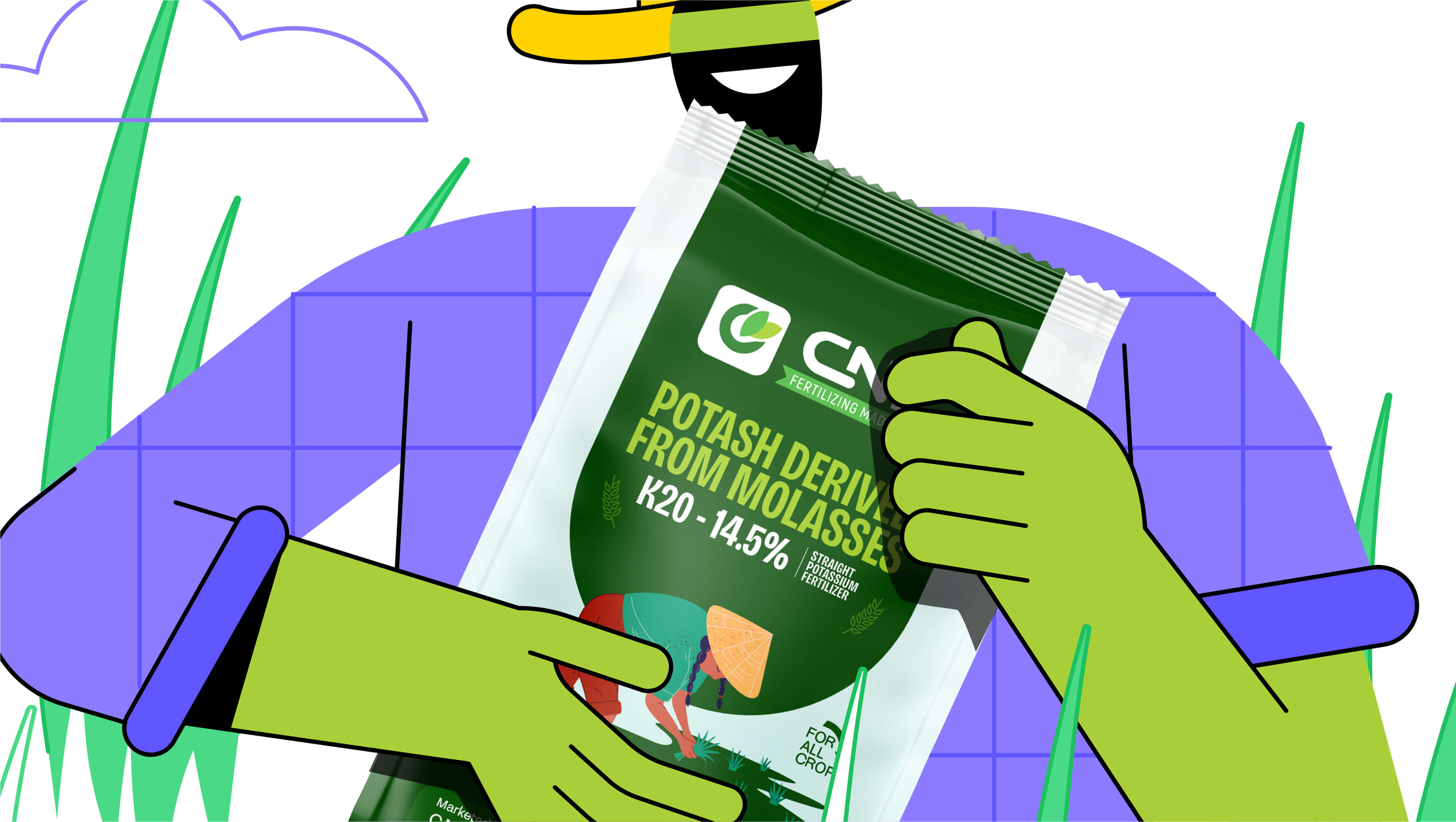
Rooted in the promise of sustainable agriculture, CNF’s Potash-Derived from Molasses-represents nature’s way of giving back to the soil. Capt. Branding Company brought this vision to life through a design that speaks the language of growth, care, and renewal. The green and white packaging symbolizes purity and balance- green for fertile lands and white for trust and clarity. A gentle illustration of a farmer nurturing his crops anchors the design in authenticity, reflecting the brand’s commitment to empowering those who cultivate the earth. With a soothing colour palette and modern typography, Capt. Branding Company bridged tradition with innovation.