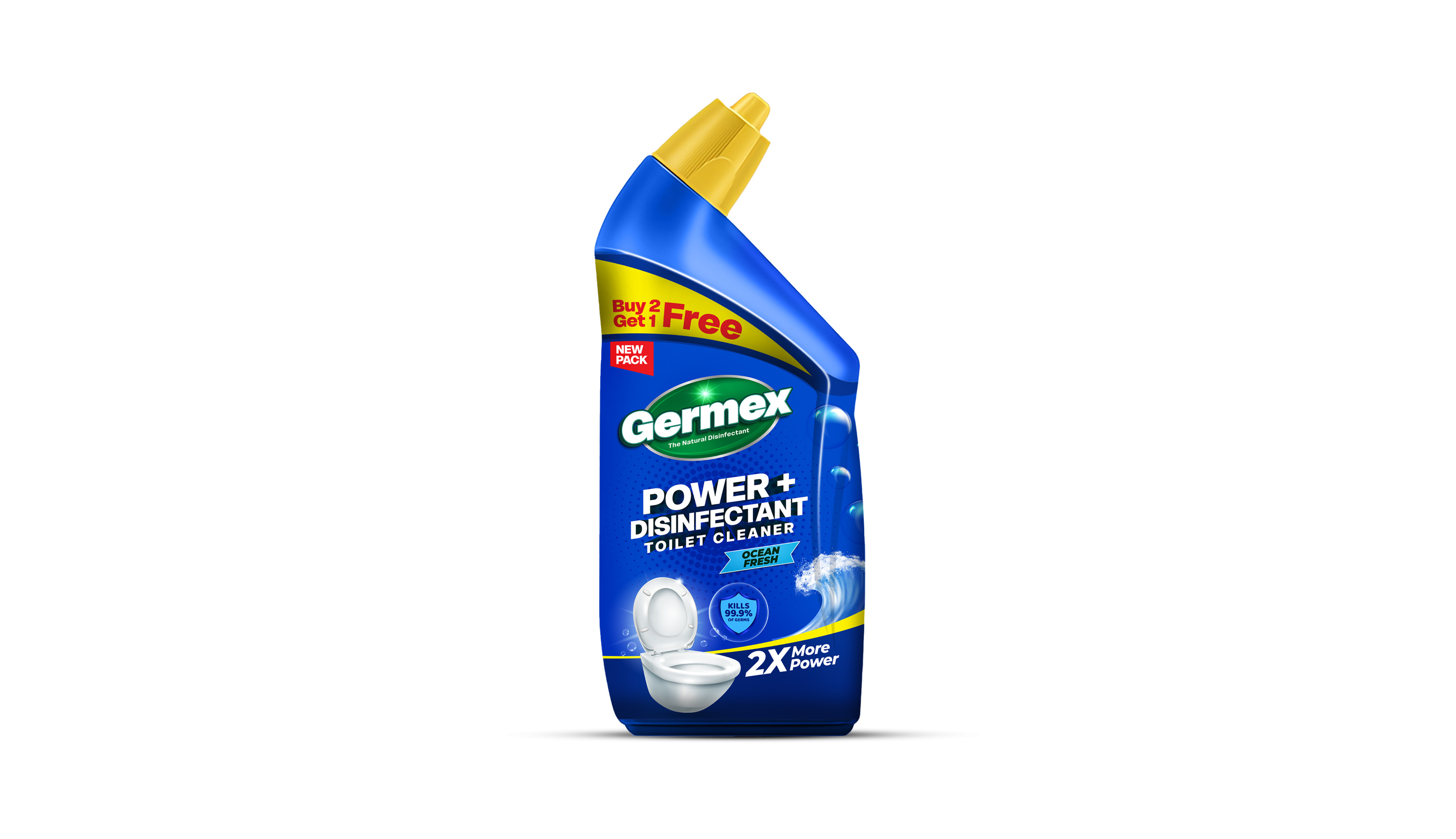
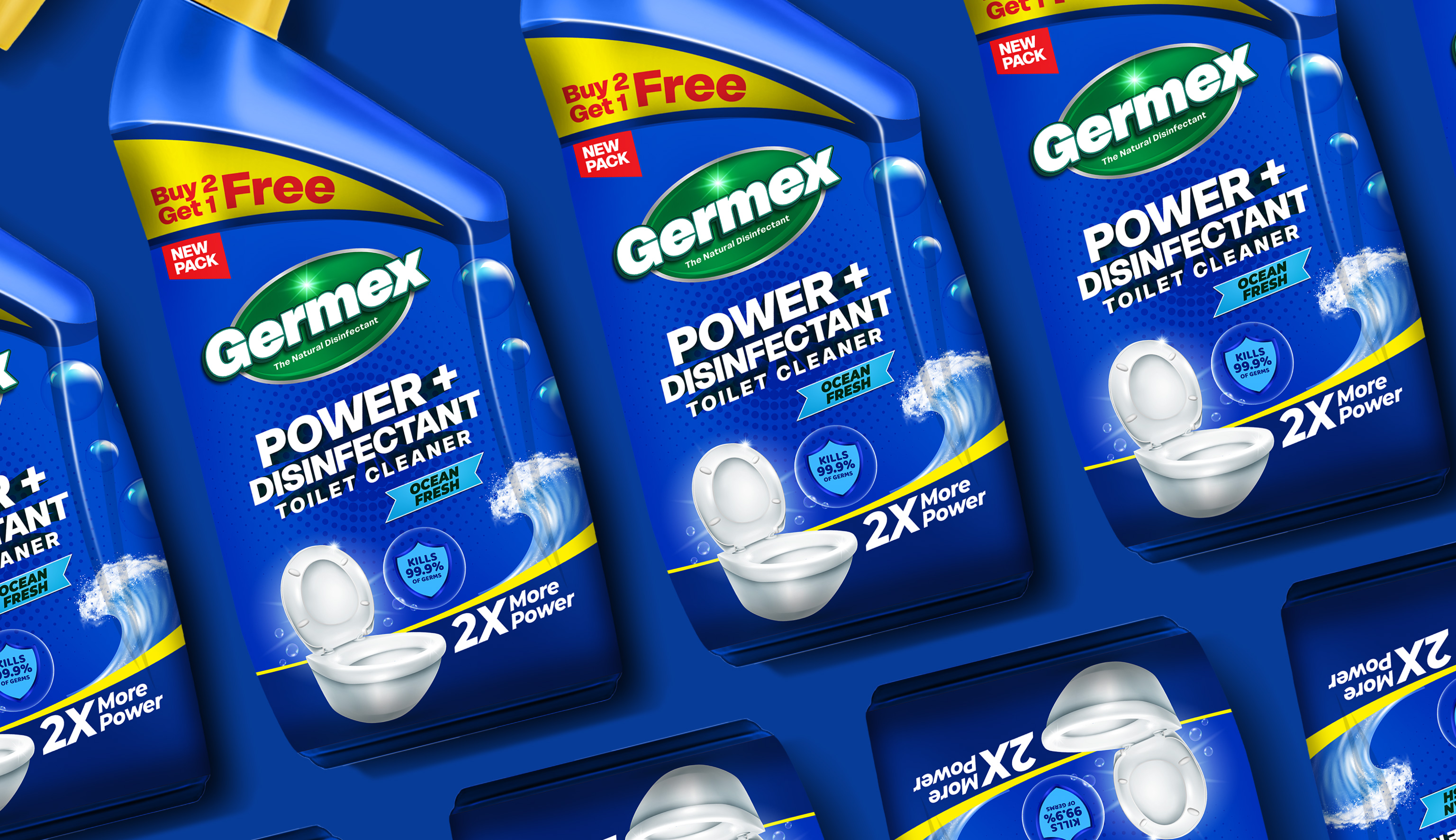
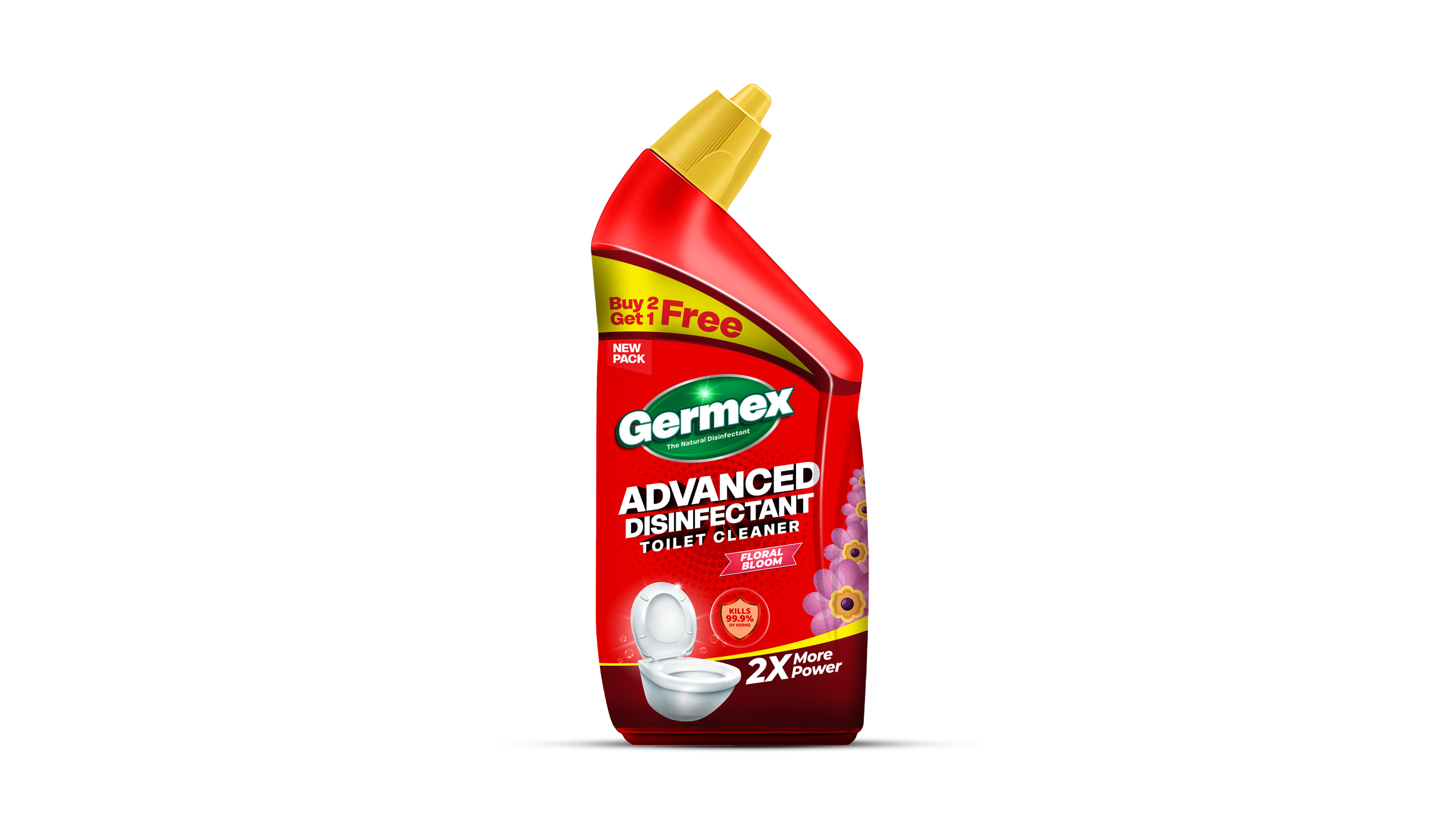
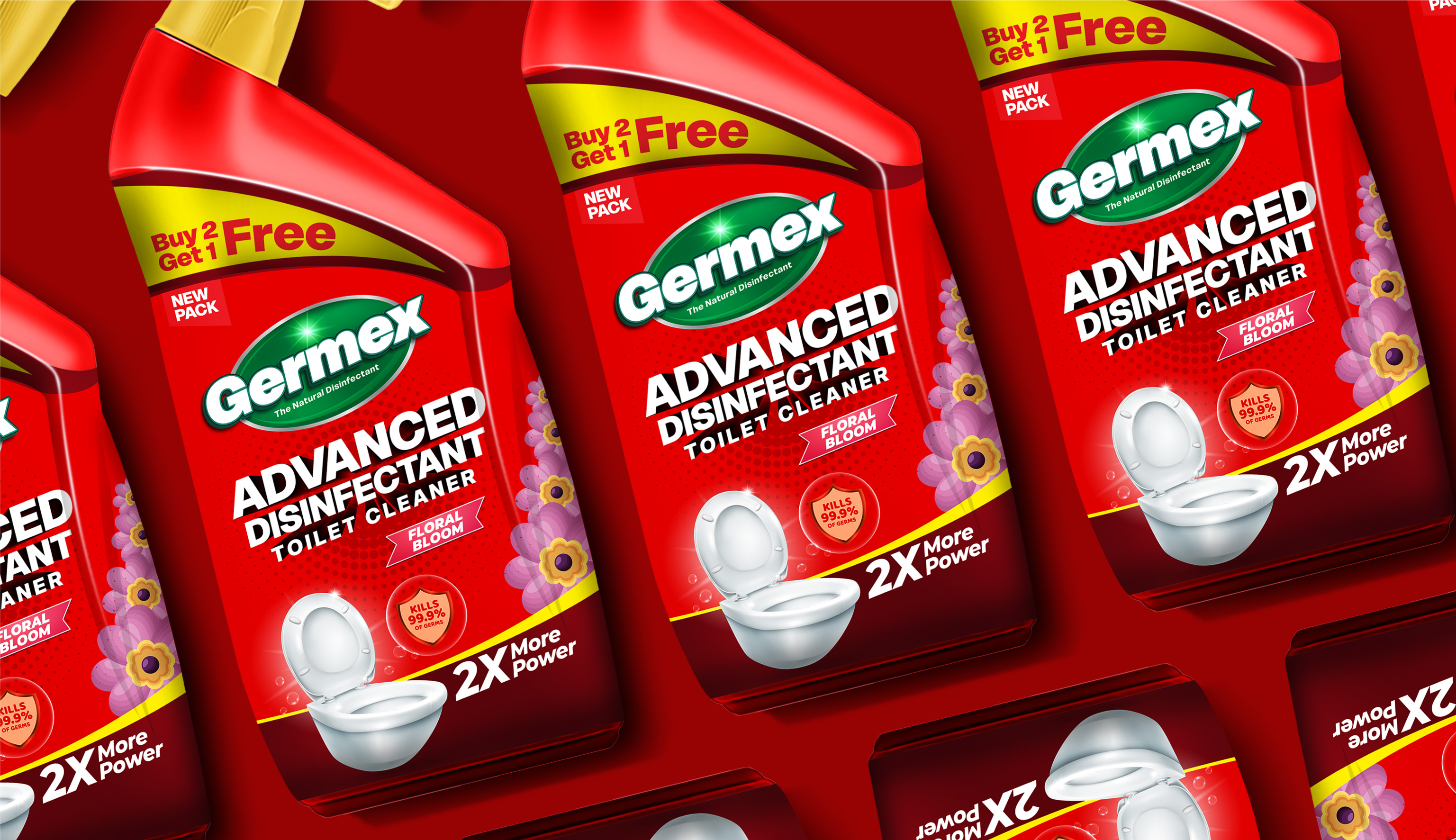
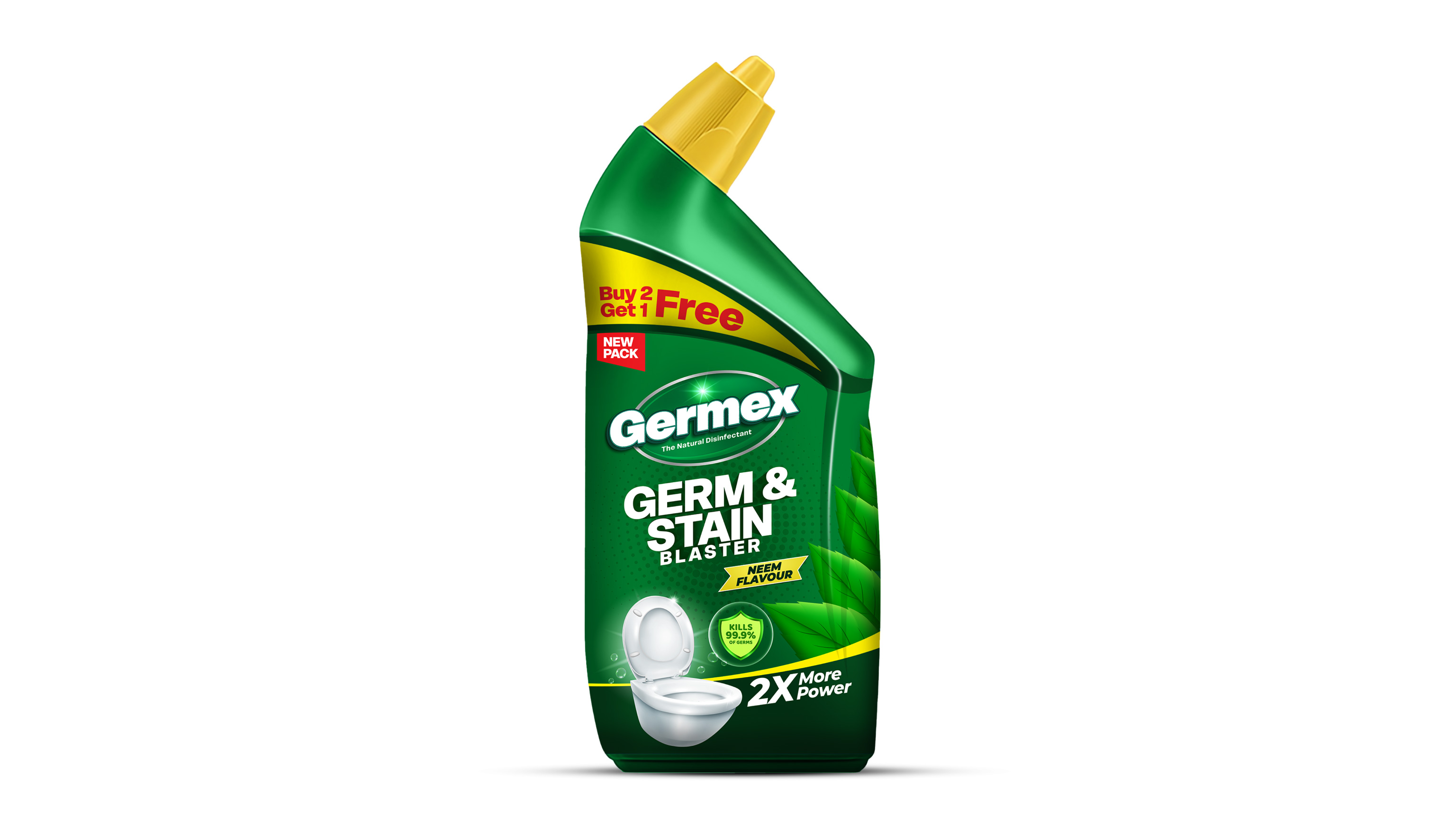
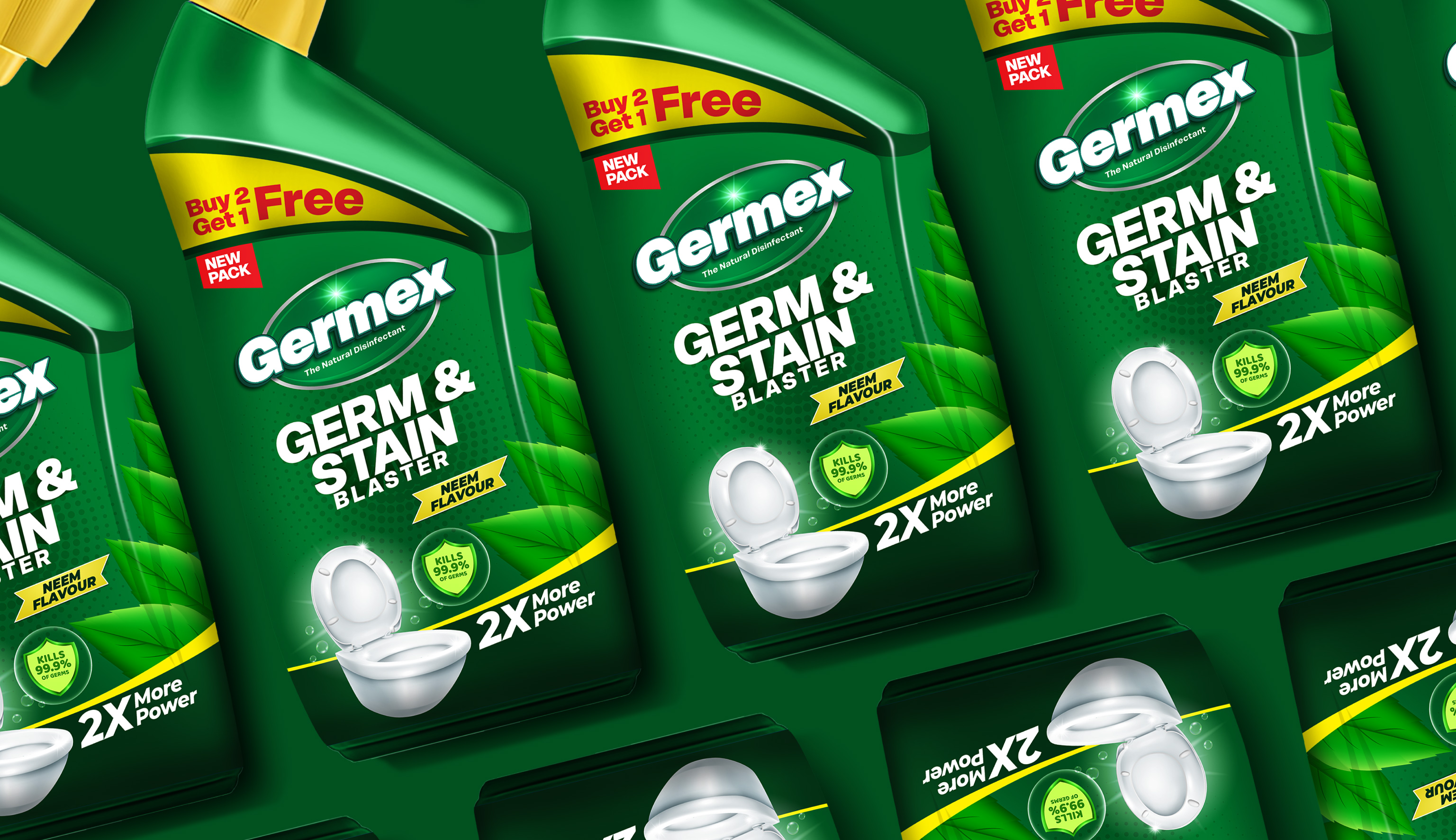
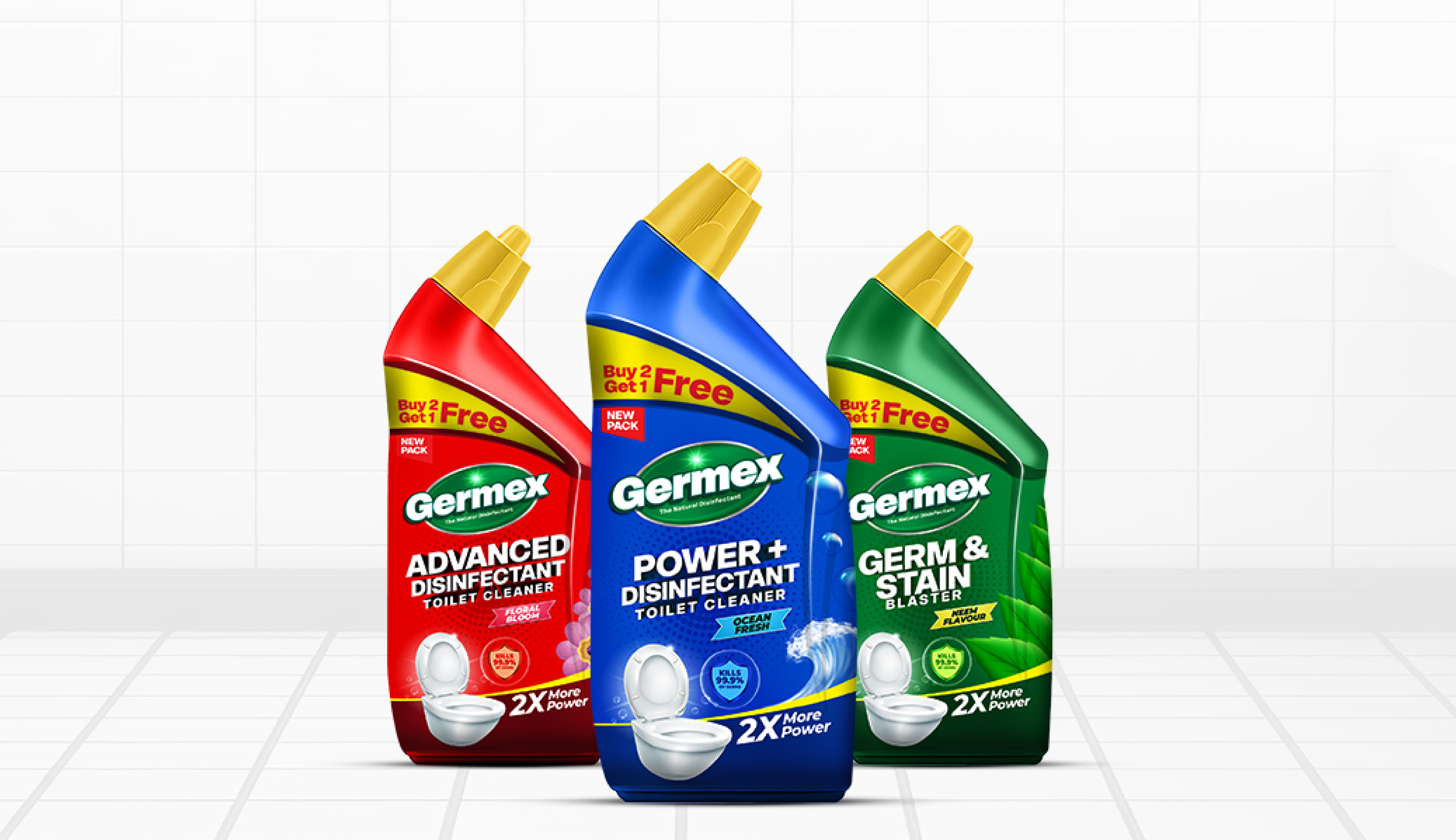
For GERMEX, an Indian hygiene focused brand, Capt. Branding Company reimagined packaging designs that speak the language of freshness, trust, and high performance. Our design direction centred around a powerful tri-colour palette -Ocean Blue, Floral Red, and Neem Green -each variant capturing the distinct essence of its formulation. The bold, curved layout and vibrant contrast create instant shelf appeal, while the strong typography reinforces the brand’s promise of protection and cleanliness. Capt. Branding Company developed three distinct packaging designs that together form a cohesive visual identity, yet each tells its own sensory story -Ocean Fresh’s cool vibrance, Floral Bloom’s lively warmth, and Neem Flavour’s natural calm. The dynamic colour flow, paired with a modern label composition, ensures the brand stands tall in a competitive retail space. The result is packaging that does not just stand out visually but also builds trust at first glance - a design that feels as clean and powerful as the product itself.
