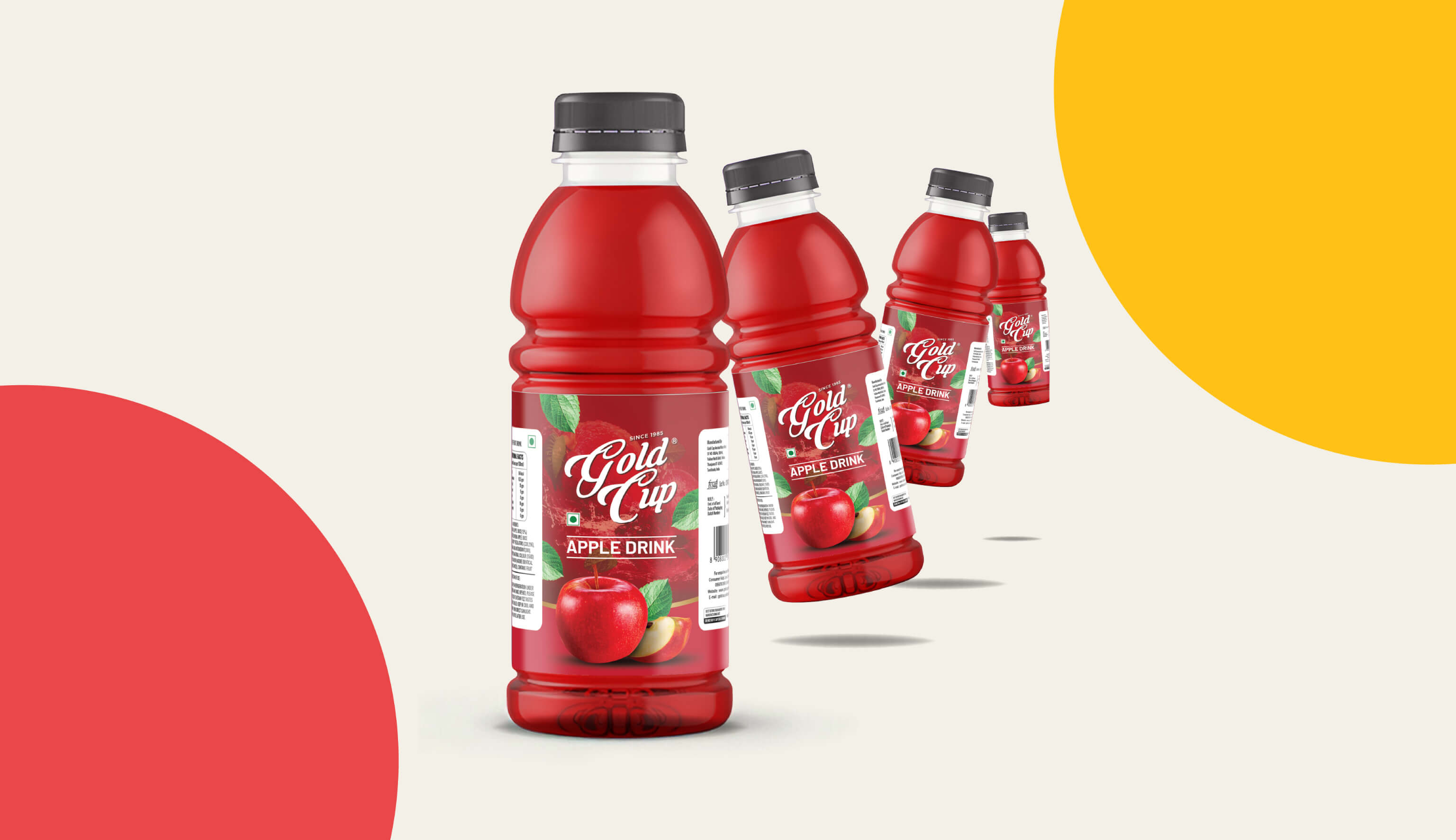
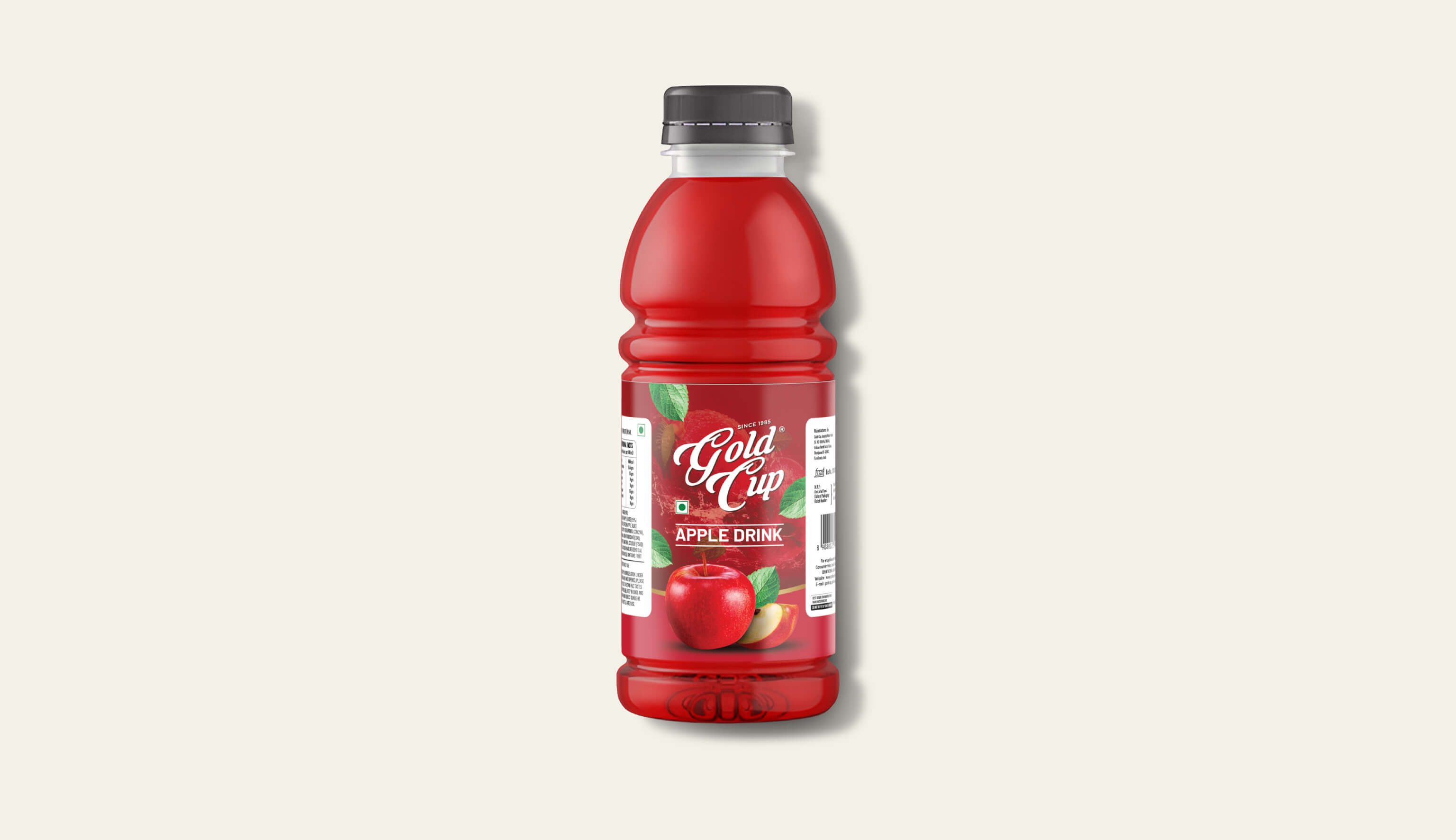
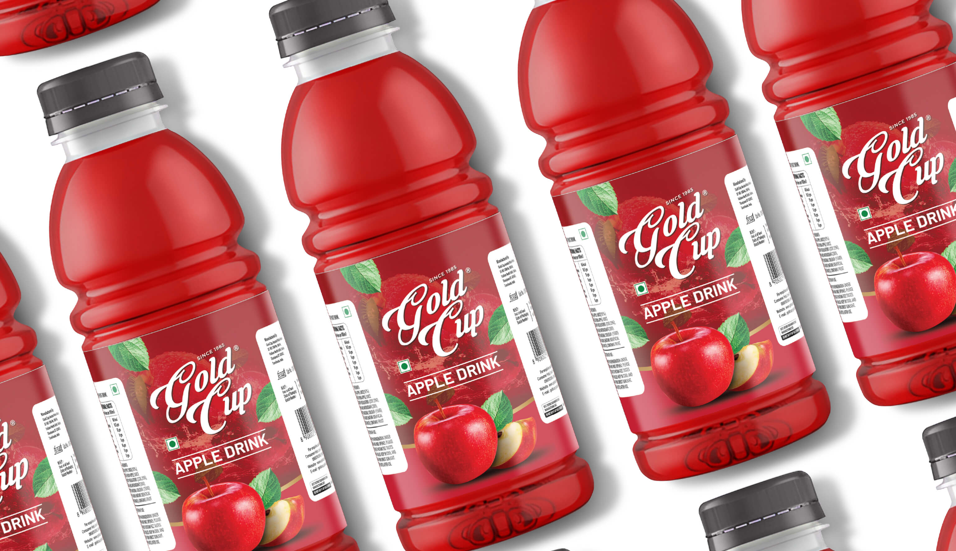
For GOLD CUP Apple Drink, the packaging design by Capt. Branding Company was a vibrant journey into bold visuals. A deep red background was chosen to evoke the rich hues of ripe apples, setting the stage for the drink's identity. The logo took centre stage with prominent visibility, ensuring the brand's presence was felt loud and clear. Typography was played up to be attention-grabbing, making sure that every detail pulled the target audience. In this design by Capt. Branding Company, visuals of apples are woven in harmoniously, adding a touch of freshness and authenticity to the packaging. The design played up the elements of the drink - the apples, the bold branding of the brand, and the overall aesthetic that screams appeal.