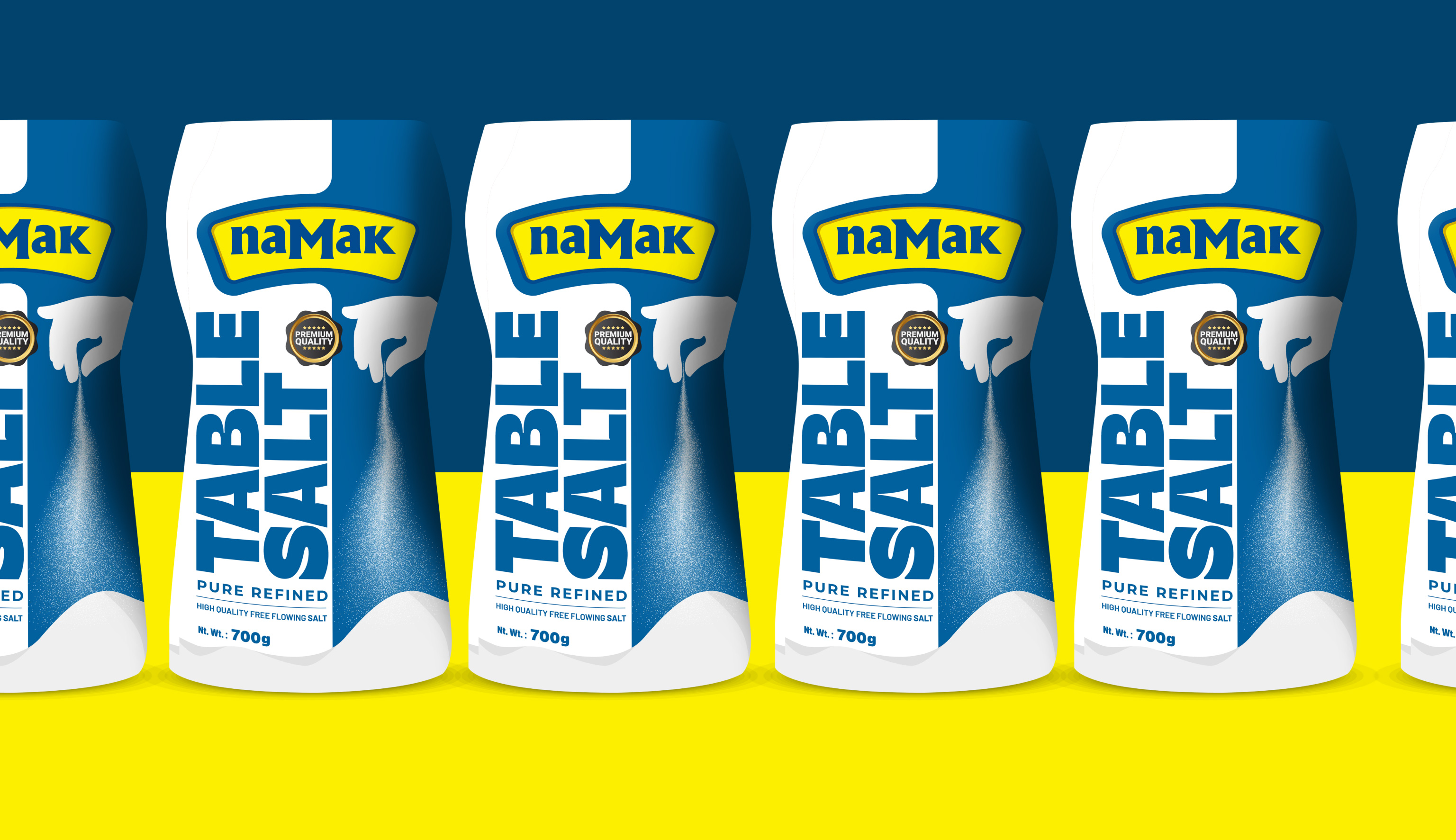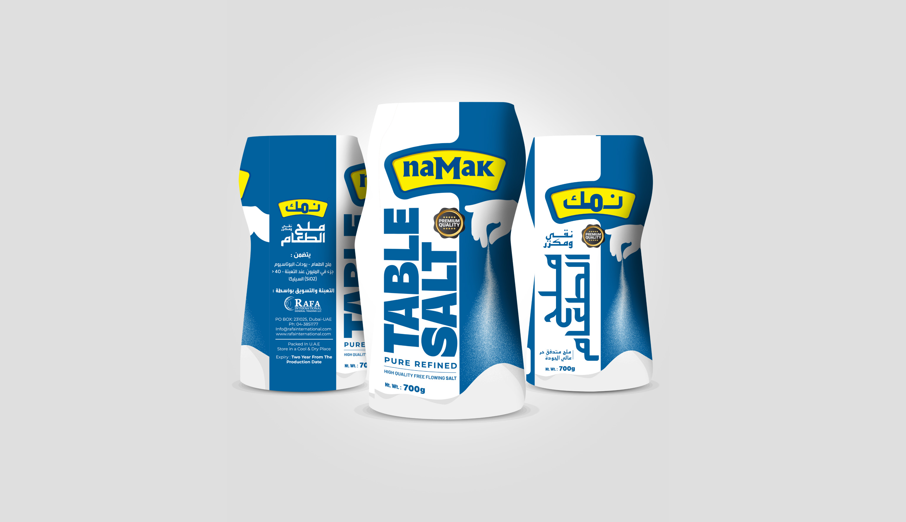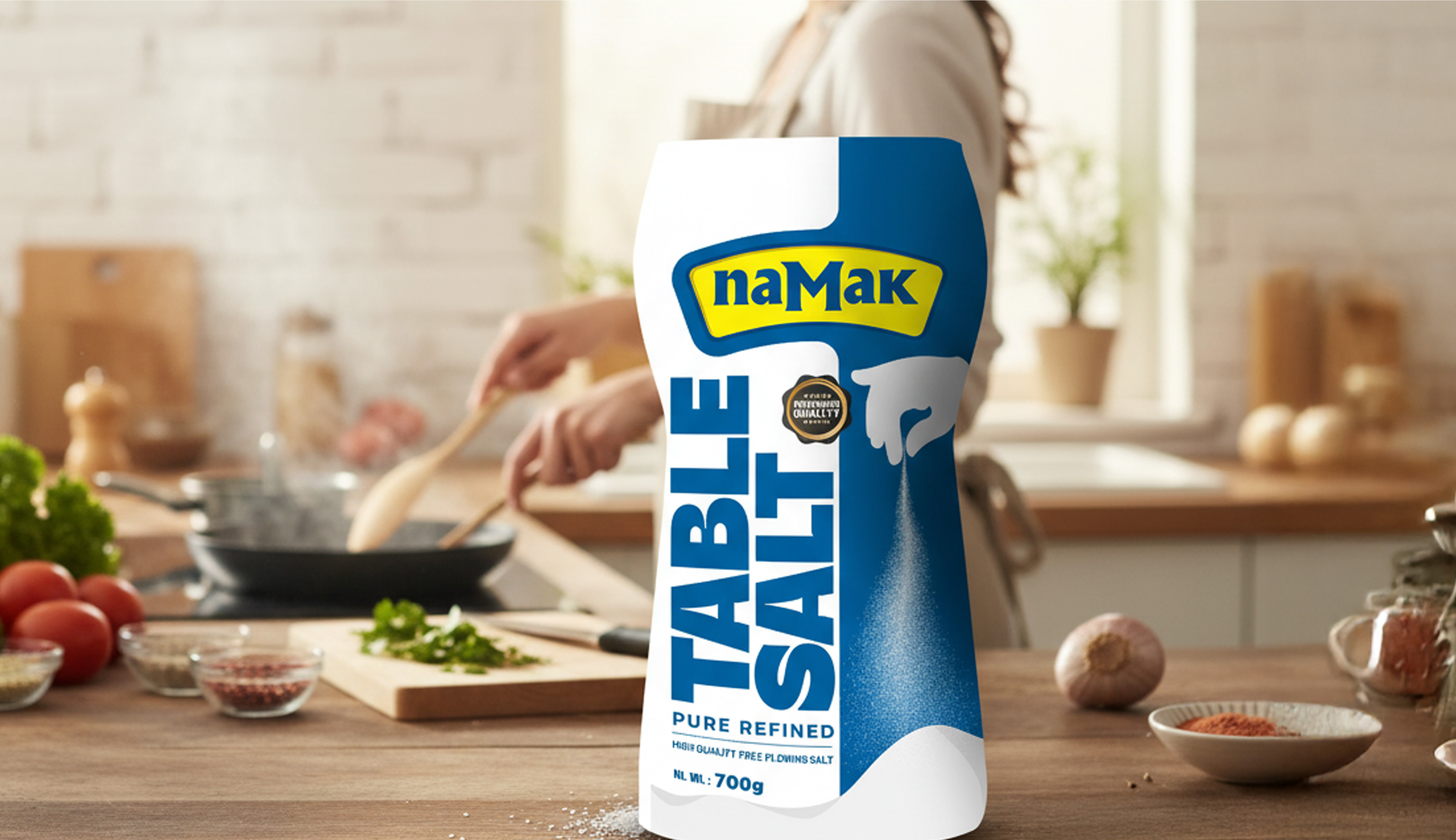
Capt. Branding Company created a packaging design for NAMAK Table Salt that is impossible to overlook. Built on the foundation of clarity and freshness, the design plays with confident blue and white colours. The bold, vertically aligned typography of “TABLE SALT” ensures instant shelf recognition, while maintaining a clean, modern aesthetic. Each design element was carefully aligned to communicate both functionality and appeal, giving the brand a strong visual identity. Capt. Branding Company added a touch of life through subtle illustration - a hand pouring salt, reinforcing the product’s everyday connection. The balance of striking graphics and thoughtful minimalism makes the packaging both practical and memorable as well.