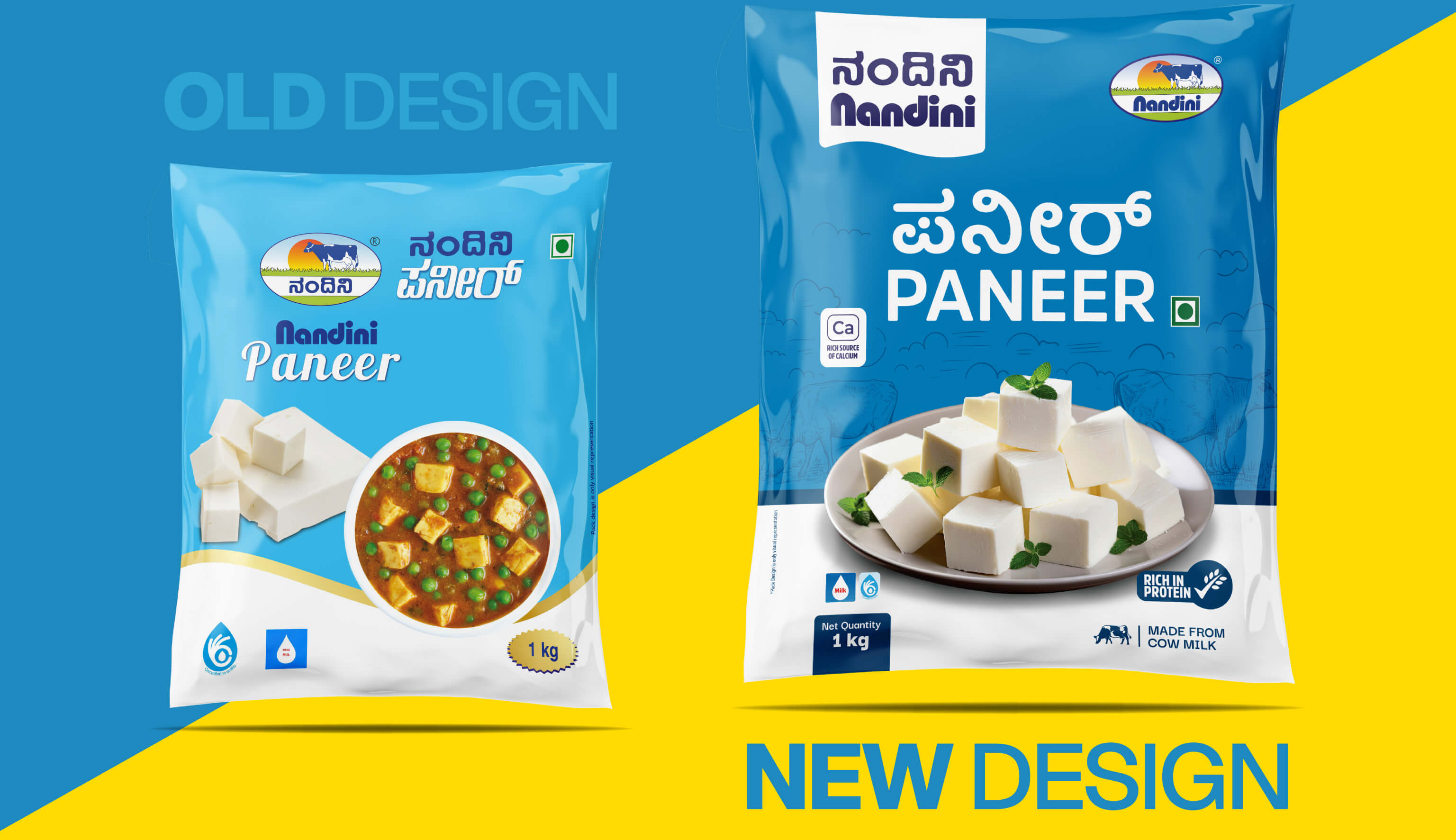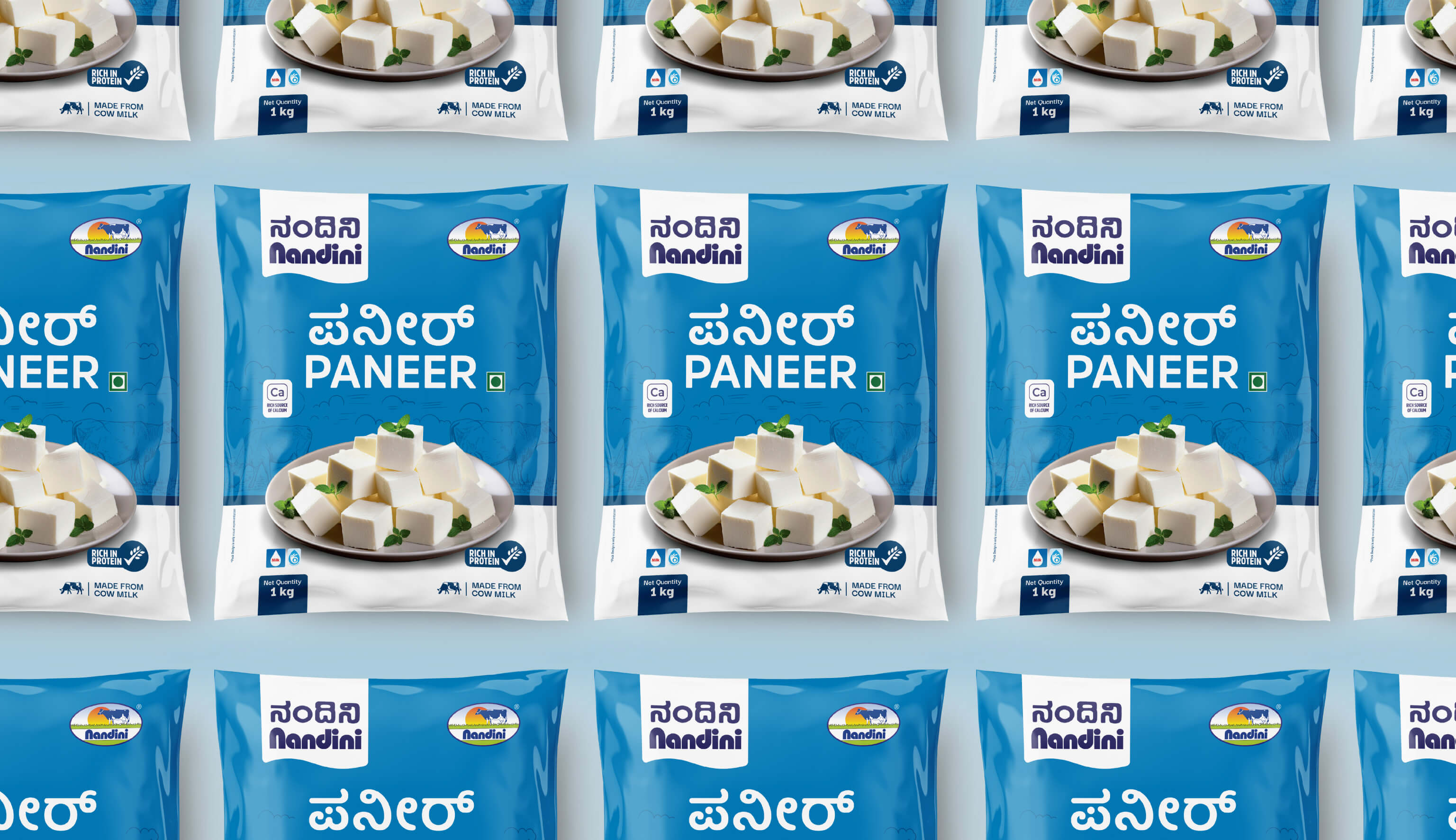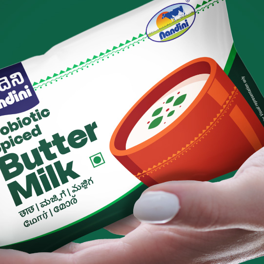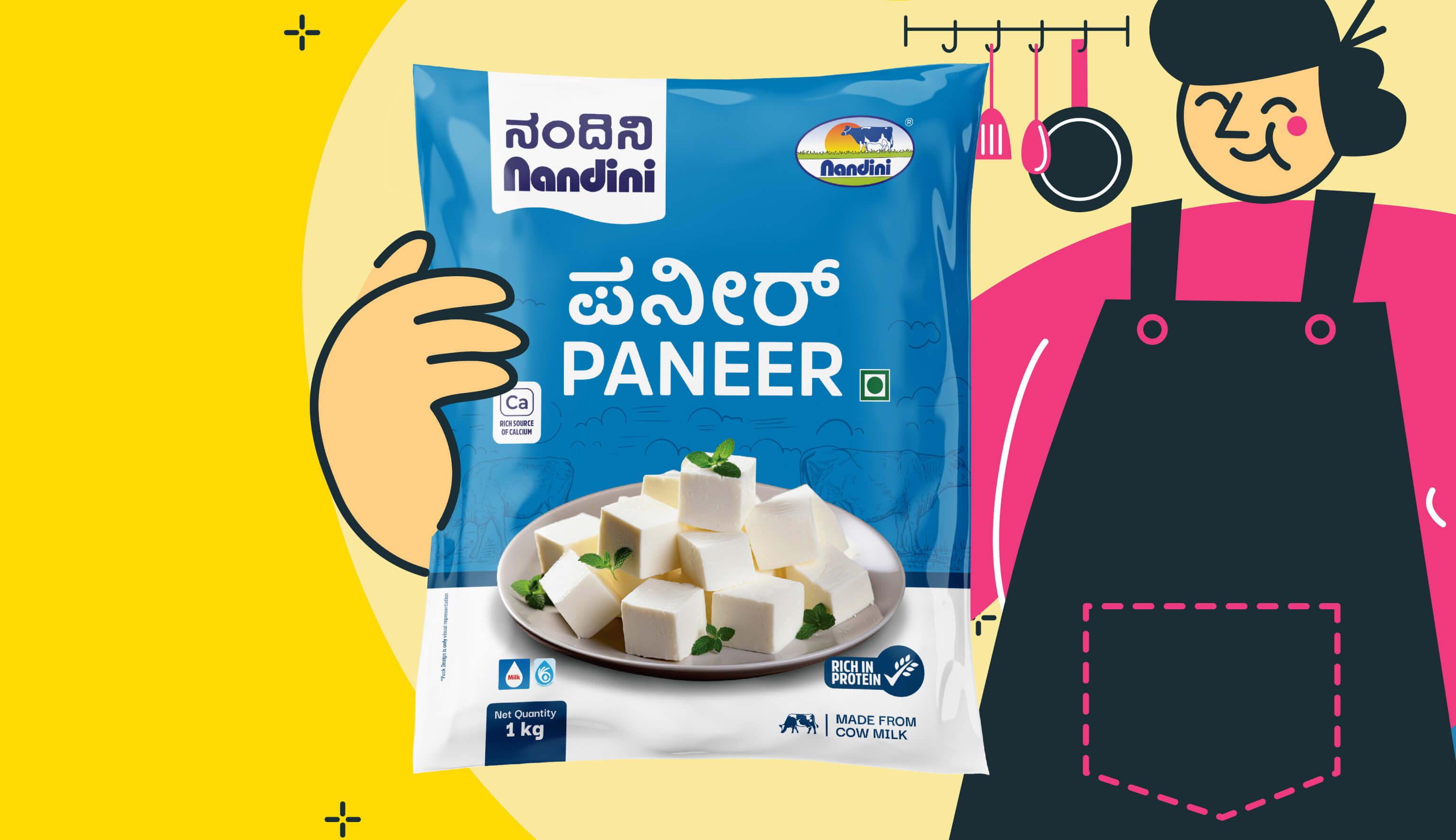
In a masterstroke of branding magic, Capt. Branding Company transformed the packaging of NANDINI Paneer, infusing it with a perfect blend of visual charm and functional finesse. Keeping the blue hue, we spotlighted the word "Paneer" in bold, impactful typography. This clever move ensured the product would not just sit on shelves – it would command attention and connect with every consumer craving authentic taste. With Capt. Branding Company's expert touch, the new packaging now flaunts appealing visuals of the product, radiating freshness and quality in every glance. The design marries aesthetics with clarity, boosting shelf presence and sparking consumer engagement. By weaving together blue palette and bold typography, Capt. Branding Company came up with a packaging redesign that is as delightful as it is effective.