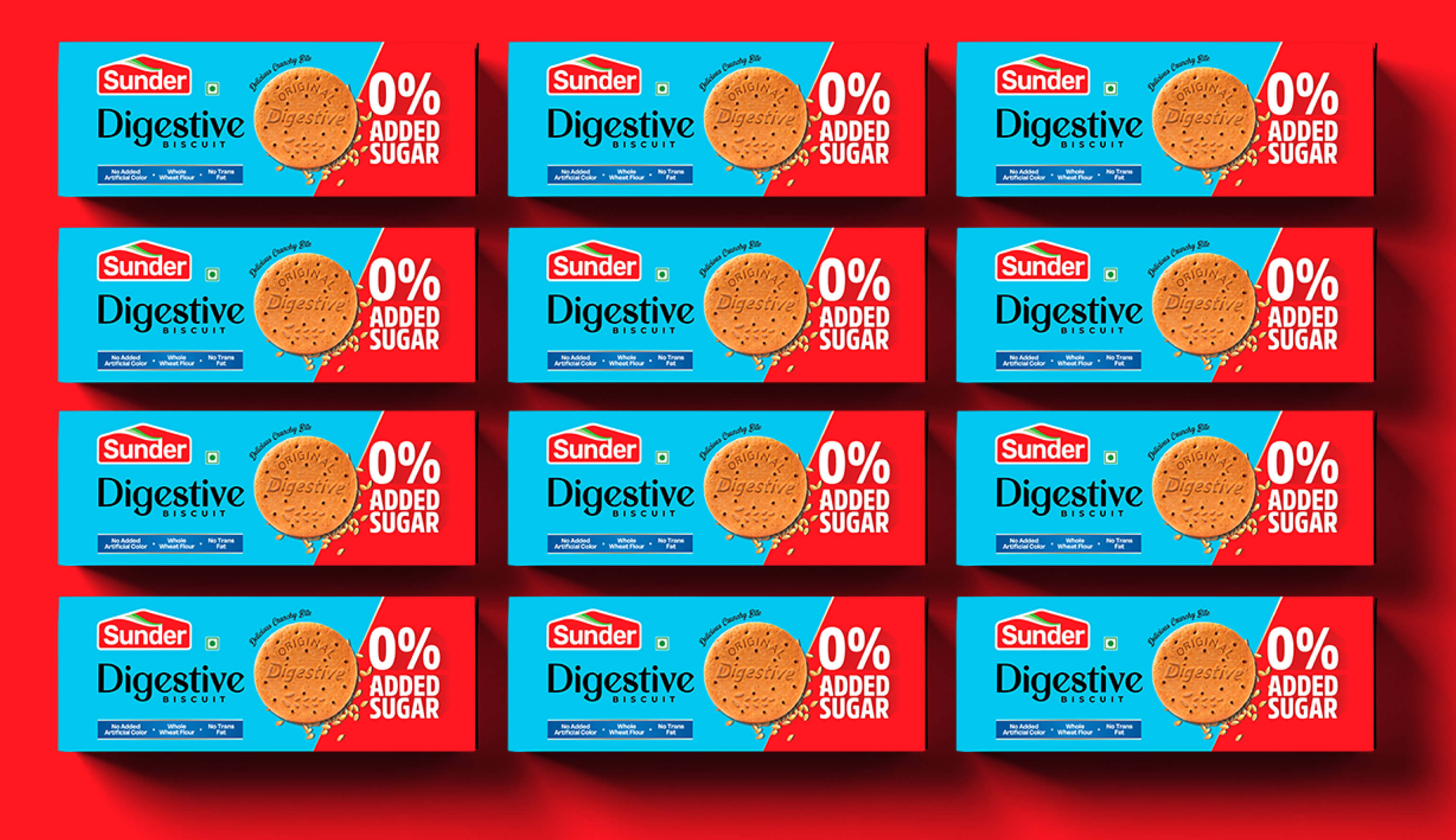
Capt. Branding Company brought to life a game-changing packaging design for SUNDER brand's Digestive Biscuits. We blended premium aesthetics with razor-sharp functionality, making it a perfect fit for both the Indian and GCC markets. The bold choice of shades - a striking blue and red - coupled with NYC inspired typography, gave the packaging an edge. A picture of the biscuit was added, making the design not just visually appetizing, but also equally attractive. The design did not just stop at looks; it was informative as well and highlighted key selling points. By tailoring the design for dual markets with a mix of premium feel, Capt. Branding Company delivered a paradigm-shifting packaging design that surely catches the eyes of consumers.

