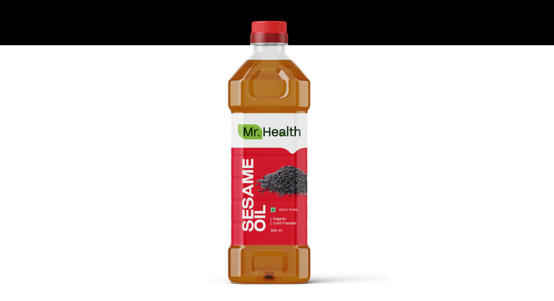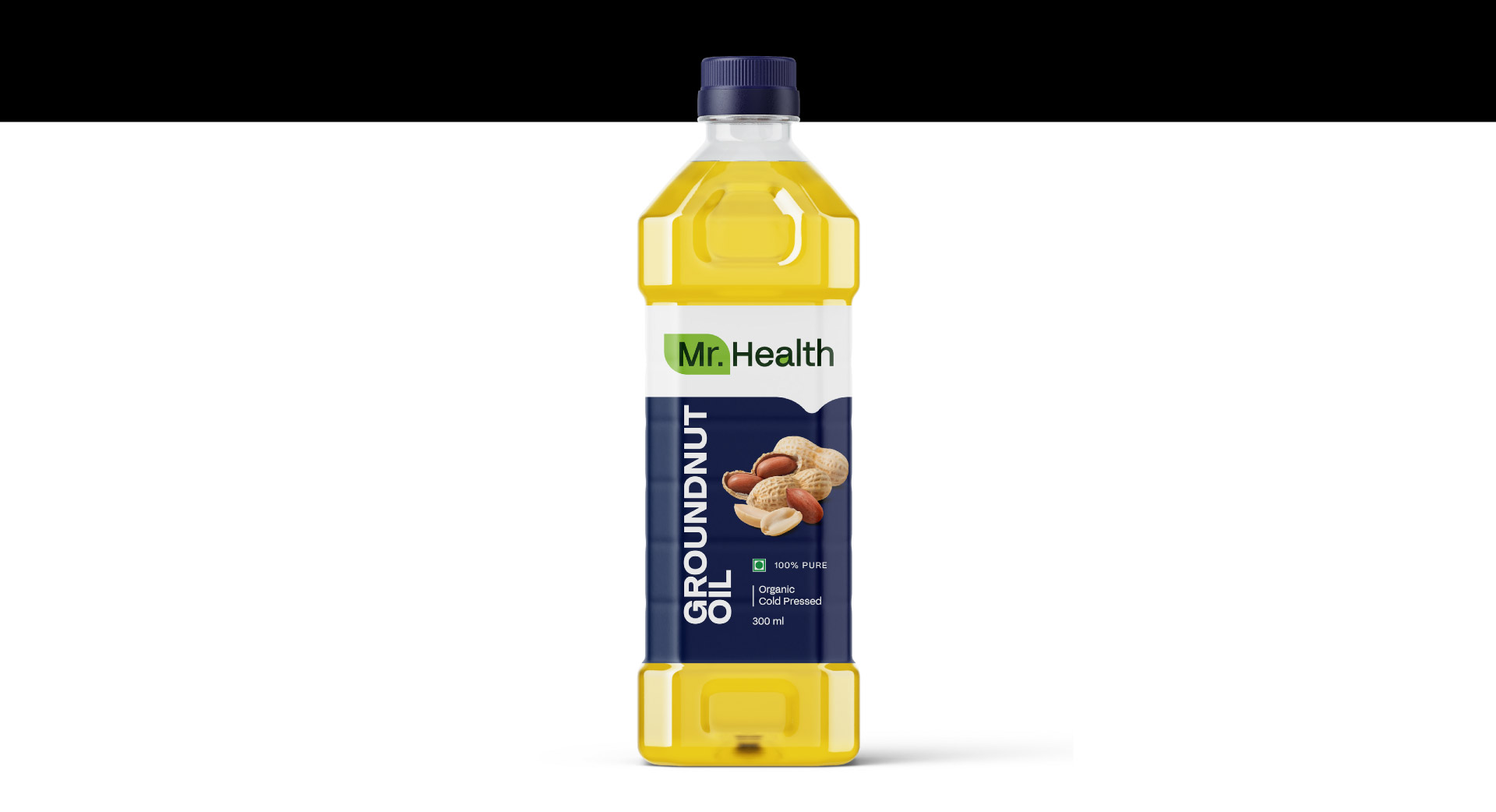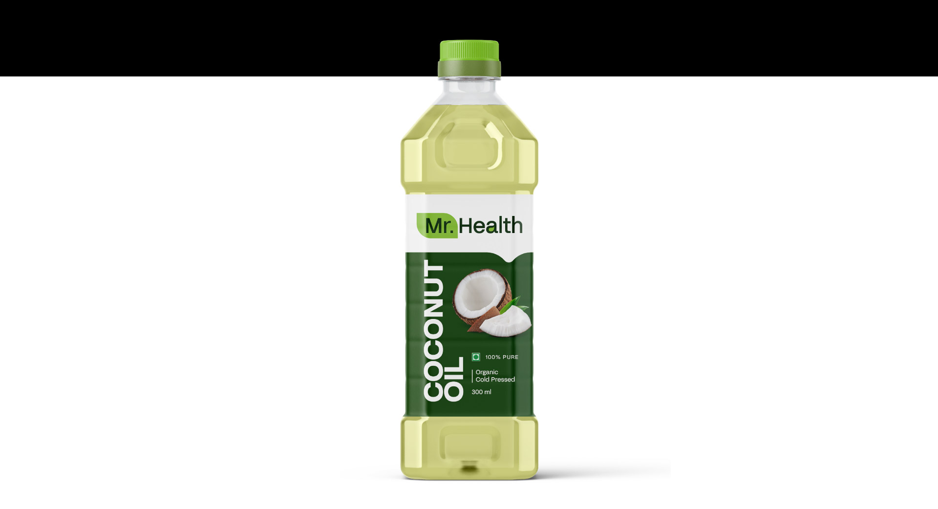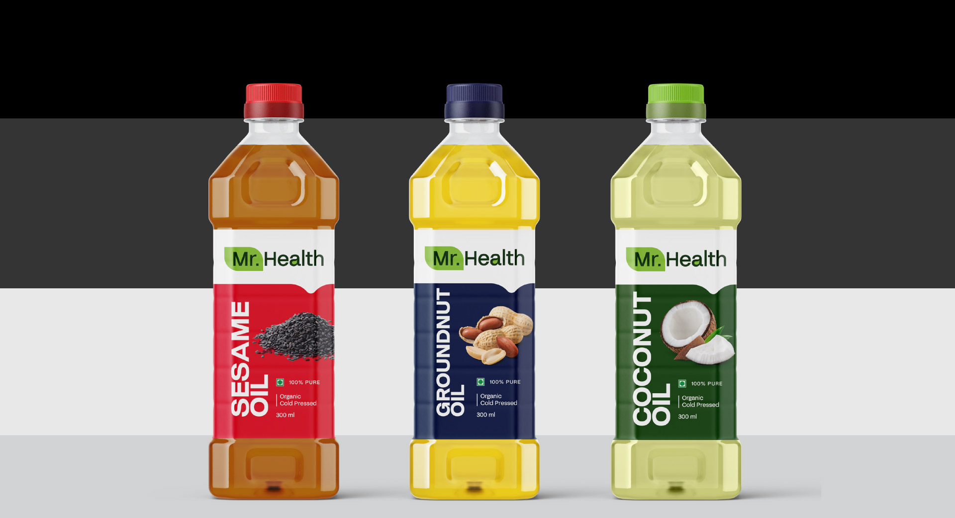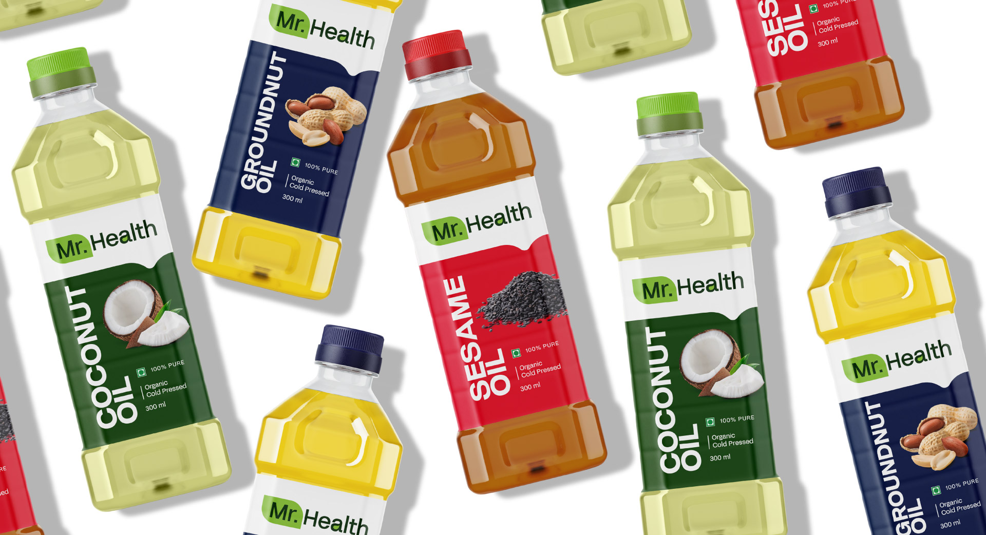
Emblazoned with the resplendent Mr. Health logo, a masterful amalgam of visual elements that embodies the brand’s ethos of wellness and vitality, our trio of premium oils boasts a distinctive packaging design that harmoniously marries form and function.
Each variant’s unique personality is reflected in its bespoke colour scheme: Coconut Oil’s verdant green packaging evokes the lush vitality of the tropics, Sesame Oil’s fiery red hue captures the essence of its bold, nutty flavour, and Groundnut Oil’s cerulean blue embodies the soothing tranquility of a clear summer sky.
This thoughtful design approach ensures that Mr. Health’s oils stand out on shelves, while the logo’s elegant typography and stylized leaf motif elegantly convey the brand’s commitment to natural wellness.”
“Capt. Branding has crafted a distinctive visual identity for Mr. Health’s oils, marrying a wellness-inspired logo with tailored packaging designs that distinguish each variant. Our expertise has elevated the brand’s presence, harmonizing creativity and strategy